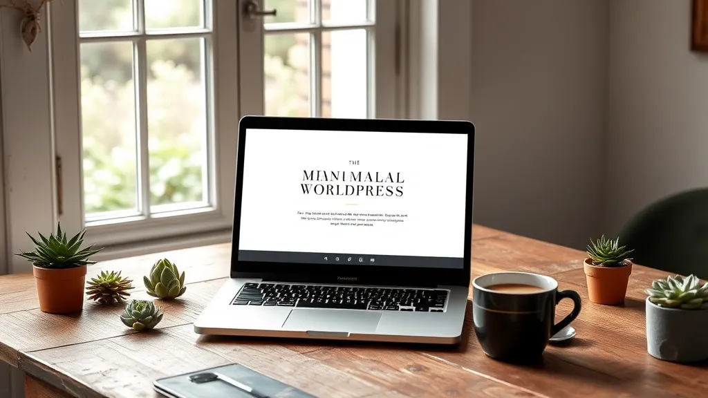
Ditching the Cookie-Cutter: The Art of Uniqueness
Alright, let’s be real for a sec. We’ve all seen those websites that look like they were churned out by some robot in a factory. You know the ones, right? Same layout, same colors, same boring stock photos. Snooze fest! If you wanna create a WordPress theme that really pops, it’s time to ditch that cookie-cutter approach. Let’s get creative!
First off, think about what makes you, well, you. What’s your vibe? Are you quirky and fun or sleek and professional? Channel that energy into your theme. If you love bright colors and funky fonts, don’t hold back! Your website is like your digital personality, so let it shine!
One cool way to stand out is through custom graphics. Seriously, nothing says “I’m unique” like original artwork. Whether you’re a doodler or you have a friend who’s a graphic design whiz, having custom icons or illustrations can make your site feel super personalized. Plus, it’s way more fun to look at than generic clipart. And hey, who doesn’t love a good doodle?
- Color Palette: Experiment with colors that resonate with you. Don’t just stick to the “safe” choices. Bold and unexpected combos can really make your site memorable.
- Typography: Fonts play a huge role in your website’s personality. Pick something that reflects your style. Just avoid the dreaded Comic Sans unless you’re going for a “totally ironic” look.
- Layout: Break the mold! Why not try a grid layout or even something asymmetrical? It can give your site a fresh feel that keeps visitors engaged.
And here’s a little tip: don’t be afraid to get a bit messy. Sometimes the best ideas come from just throwing stuff together and seeing what sticks. If something feels off, tweak it! This isn’t a high-stakes exam; it’s your creative playground. If you make a mistake, just laugh it off and try again. Trust me, I’ve been there more times than I can count!
Lastly, remember to keep your audience in mind. What do they want? What will grab their attention? Craft your unique elements in a way that resonates with them, not just with you. It’s all about striking that balance between your style and what your visitors dig.
So, ditch the cookie-cutter vibe, embrace your uniqueness, and let your WordPress theme be a true reflection of who you are. After all, in a world full of copies, be an original!
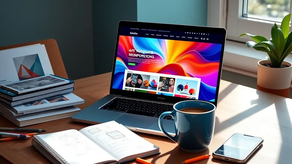
Colors That Pop: Painting Your Digital Canvas
Alright, let’s dive into the colorful world of web design! Choosing the right colors for your WordPress theme is like picking toppings for your pizza. Too much of one thing can mess it all up, but the right combo? Total game changer! 🎨
First off, colors set the mood. You want your visitors to feel something when they land on your site, right? So, think about what vibe you’re going for. Are you selling handmade candles? Maybe soft yellows and earthy greens will give that cozy, warm feeling. Or if you’re in the tech game, sleek blues and greys scream “I’m professional, but I can still party!”
- Warm Colors: Reds, oranges, and yellows can really grab attention. Just don’t go overboard, or your site might look like a clown convention!
- Cool Colors: Blues, greens, and purples tend to be more calming. Think about those spa websites—super chill, right?
- Neutrals: Grays, whites, and blacks are like the bread and butter of design. They provide a balance and let other colors shine without being too in-your-face.
Now, here’s a tip: try using a color wheel. I know, I know, it sounds like something from art class you’d rather forget, but it’s super helpful! Complementary colors (you know, colors that are opposite each other on the wheel) can create some serious eye candy. Just imagine a bright orange paired with a cool blue. It’s like peanut butter and jelly but for your website!
Also, don’t forget about accessibility. You want everyone to enjoy your digital masterpiece, right? Using high contrast between text and background not only makes it easier to read but also helps those who might have trouble seeing certain colors. Trust me, your visitors will appreciate it. Plus, it just feels good to be inclusive!
And hey, if you’re ever in doubt, look at your favorite sites for inspiration. Sometimes it’s just about grabbing a little piece of what you love and making it your own. Just don’t copy, because that’s like stealing someone’s fries! No one wants that.
So, paint your canvas with intention! Choose colors that not only pop but also reflect your brand’s personality. Your theme should be as unique as you are. Happy designing!
Typography Tango: Dancing with Fonts and Styles
Alright, let’s get into the fun stuff: typography! I mean, who knew picking fonts could feel like a dance-off, right? Seriously though, fonts have this magical way of making or breaking your whole vibe. You want your site to feel like a cozy coffee shop, not a sterile office waiting room.
First things first, you gotta think about the mood you’re trying to create. Are you going for chic and modern, or more like whimsical and fun? For instance, if you’re designing a site for a kid’s party planner, you might wanna go with something playful like a handwritten font. But if you’re creating a portfolio for, say, a lawyer (yawn, I know), stick with something clean and professional like Helvetica or Georgia. It’s all about matching your fonts to your brand’s personality.
Now, let’s talk about font pairing. This is where the real magic happens, but also where things can go downhill fast. Like, if you pair a fancy script font with a super bold serif, it can look like two people at a dance party who just don’t mesh. You want harmony, not chaos! A good rule of thumb is to pick one font for headings and another for body text. Just make sure they complement each other. Think of it like peanut butter and jelly—perfect together!
- Heading Font: Go bold and eye-catching. This is your chance to show off!
- Body Font: Keep it readable. You want folks to be able to binge-read your content like it’s the latest Netflix series.
And here’s a pro tip: mix weights, not styles. For example, using a regular weight for body text and a bold weight for headings can create a nice hierarchy without being too wild. It’s like saying, “Hey, look at me!” without yelling.
Also, don’t forget about line spacing and letter spacing. It might seem like a small detail, but trust me, it makes a difference. Too tight and it looks cramped, too loose and it feels disjointed. Aim for that Goldilocks zone—just right!
Lastly, always check how your fonts look on different devices. You don’t want your beautiful site to turn into a font disaster on a mobile phone. So, do a little jig on your phone and desktop to see how they dance together.
In the end, typography is all about expressing your brand’s personality. Have fun with it! So don your best dance shoes and get ready to tango with those fonts!
Nailing the User Experience: Crafting a Journey, Not Just a Site
Alright, let’s chat about user experience (UX) because, honestly, it’s kinda like the secret sauce to a great WordPress theme. You want folks to not just visit your site, but to actually stick around and enjoy their time there. Think of it as throwing a party—would you want your guests to feel confused and lost, or would you rather they have a blast? Exactly.
First things first, you gotta think about the flow. It’s like when you’re walking through a really cool art exhibit. You don’t want to bump into walls or miss half the stuff because the layout’s a hot mess. Your site should guide people from one point to another smoothly. So, what does that mean in practical terms? Well, make sure your navigation is clear and easy to use. No one wants to play hide and seek with your menu!
- Keep it Simple: Too many options can be overwhelming. Just like a buffet, it’s great to have choices, but if there’s too much, you end up just staring at the food.
- Visual Hierarchy: Use size and color to show what’s important. It’s like highlighting the best parts of your favorite book. Show ’em what to focus on!
- Responsive Design: More people are browsing on their phones these days. Your site should look fab on every device. No one wants to squint at a tiny screen!
And let’s not forget about loading times. If your site takes longer to load than you take to decide what to order for dinner, you’re gonna lose visitors faster than you can say “buffering.” Seriously, no one likes waiting around. Optimize those images, clean up your code, and get a decent hosting plan. It’s worth it, trust me.
Oh, and here’s a little personal tip: don’t underestimate the power of a good search function. If someone’s looking for something specific, they shouldn’t have to scroll through a million pages to find it. It’s like having a GPS in a city you’ve never been to—super helpful!
Lastly, always be open to feedback. You know how sometimes you think you’ve nailed a recipe, but then someone tries it and you realize it’s way too salty? Yeah, your site might need a little tweaking too. Ask users what they think, and be ready to make some changes. After all, you’re in this to create an awesome experience, right?
So, remember, crafting a site isn’t just about slapping together some pretty graphics and calling it a day. It’s about creating a journey that people will want to take over and over again. Happy designing!